
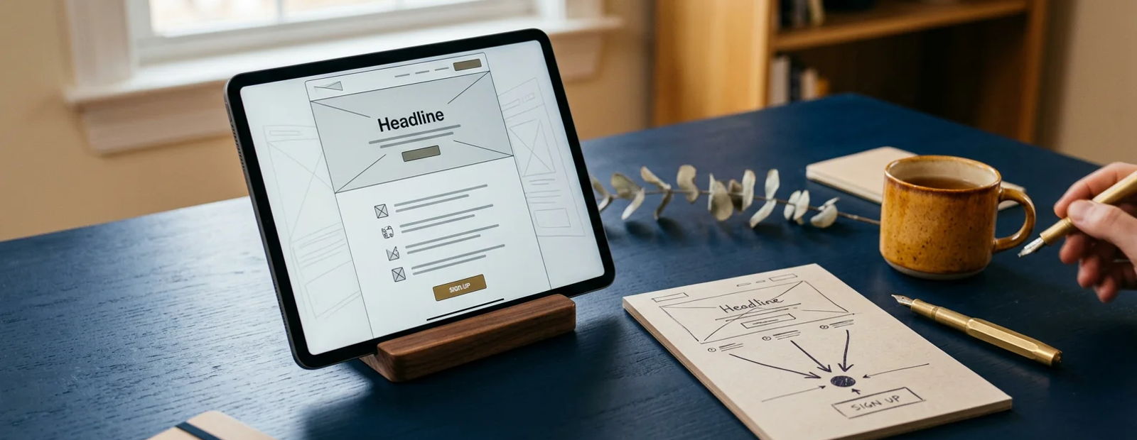
Your homepage has ten jobs; a landing page has one. That single difference is why a dedicated page for an offer routinely converts several times better than the same offer mentioned on a busy site, and why every quiz, guide, program, and campaign in your practice deserves its own page with nothing on it but the path to yes.
This is the consolidated guide: the anatomy section by section, benchmarks by offer type, the mistakes that quietly halve conversion, and how to run landing pages as a system that evolves with your practice instead of a pile of one-off projects.
The one-job rule
A landing page exists to get one specific visitor to take one specific action: take the quiz, register for the training, book the visit, enroll. Everything on the page either serves that action or competes with it, and competition loses conversions: navigation menus, footer link farms, second offers, and "learn more about us" detours all leak visitors who were on their way to yes.
The test for every element: does this move the right visitor toward the action, or is it here because pages usually have one? Remove everything in the second category. What is left is a landing page.
The anatomy, top to bottom
1. Headline: their words, your promise. The visitor arrived from an ad, email, or post that promised something; the headline confirms they are in the right place, in the language they think in. "Find out what is actually driving your fatigue" beats "Comprehensive Wellness Assessment" every time it has ever been tested.
2. Subheadline: the mechanism and the cost. One sentence on what it is and what it takes: "A 3-minute assessment, with a personalized result and next steps."
3. Outcome bullets, three to five. What they will know, feel, or be able to do afterward. Outcomes, not features: "know which of the 4 patterns fits your symptoms" rather than "12 questions across 4 categories."
4. One credibility block. Who you are in two lines, credentials, one review or result relevant to this exact offer. In healthcare this section is non-negotiable; nobody gives symptoms or email to an anonymous page.
5. The action, unmissable. One button, high contrast, verb-first label matching the promise ("Get my result," "Save my seat," "Book my visit"). Repeat it after each scroll-depth section; on mobile, keep it reachable.
6. Friction handlers. The two or three lines that dissolve the standing objections: how long it takes, what it costs (or that it does not), what happens to their email, whether this is medical advice. A single quiet reassurance line under the button ("Takes 3 minutes. No spam, unsubscribe anytime.") pays for itself daily.
7. Nothing else. No menu, no sidebar, no unrelated links. The logo can link home for legitimacy; that is the only exit ramp a landing page needs.
Benchmarks by offer type
Numbers to judge yourself against, from health pages in the wild:
Offer type | Healthy conversion (cold traffic) |
|---|---|
Quiz or assessment | 20 to 40 percent |
Guide or download | 10 to 25 percent |
Webinar or training registration | 20 to 35 percent |
Discovery call or booking page | 10 to 25 percent (warm traffic much higher) |
Paid program checkout (from nurture) | 2 to 8 percent of sequence entrants |
Below the range, fix in this order: headline-to-traffic match, then the form or booking friction, then proof, then design polish. The quiz and funnel guides cover what happens before and after the page; the ads playbooks cover the traffic these benchmarks assume.
The mistakes that halve conversion
Sending traffic to the homepage. The original sin. Every campaign gets its own page.
Message mismatch. The ad says "fatigue," the page says "wellness optimization." Visitors do not translate; they leave.
Asking too much, too early. Every extra form field costs signups. Name and email; the intake questionnaire belongs after the relationship exists.
Burying the button below biography, philosophy, and history sections that belong on your about page.
Overclaiming. In health offers, "transform your life in 7 days" converts worse than modest specificity, and it invites compliance trouble besides. Precise and honest is the winning voice.
Slow and heavy. The two-second mobile standard from our website design guide applies double here, because landing traffic is often paid traffic; every slow second is money.
Run pages as a system, not projects
Practices evolve: this season's lead magnet, next season's program launch, a new service next year. Treat landing pages as a living system rather than one-off builds:
One evergreen page per standing offer (your quiz, your booking page, your program), continuously improved via the monthly numbers, never rebuilt from scratch.
Duplicate-and-adapt for campaigns: the webinar page for spring becomes the fall version in an hour, because structure and proof carry over.
A/B test one element at a time (headline first, always headline first) and let each page accumulate its lessons.
Keep pages, funnels, forms, and email in one platform so every improvement connects: on Hiveality, landing pages live inside funnels with forms, quizzes, email, and payment steps native, and Agent Bee drafts or revises a page from a sentence of direction. The page you build this season becomes infrastructure, not archaeology.
Frequently asked questions
How long should a health landing page be? As short as the decision allows: quiz and guide pages convert best short (one or two screens); paid program pages earn their length with proof and objection-handling. Length follows price and risk, not fashion.
Do I need different pages for ads versus email traffic? Usually one page serves both, but warm email traffic tolerates shorter pages and converts higher. If ad policy requires extra disclaimers, keep a paid-traffic variant.
What about pop-ups on landing pages? Almost never. The page already has one job; an interruption competes with it. Save pop-ups for content pages, where they add a capture path that did not exist.
How many landing pages should a practice have? One per standing offer plus one per active campaign; for most practices that is three to six live pages. More pages than offers is a maintenance problem, not a marketing strategy.
Can AI write my landing page? It can draft the structure and first copy in minutes (Agent Bee does exactly that), and you supply the two things only you have: the patient language from your treatment room, and the honest proof. That combination beats both pure-AI and blank-page approaches.
Build the page with one job
Hiveality gives every offer its page in minutes: funnel and landing page builder, quizzes and forms native, email follow-up attached, benchmarks visible in analytics, and Agent Bee drafting the first version from your description.
Get Started or Book a Call and give your best offer the page it deserves.
Related Posts

How Many Patients Is Your Practice Losing to Missed Calls?
The uncomfortable math: a large share of calls to appointment-based practices go unanswered, most callers won't leave a voicemail, and each lost caller is a patient with real lifetime value. Run your own numbers.

Missed Call Text Back vs. AI Receptionist: Which Does Your Practice Need?
Text-back is reactive: it apologizes after the call was lost. An AI receptionist is proactive: it answers the call. Here is the honest breakdown of when each matters, and why the strongest setup is both.

The Best Email Marketing for Health Coaches (2026)
Email is the health coaching business. Hiveality, Kit, ActiveCampaign, and Mailchimp honestly compared against the five jobs a coach's email actually does: capture, nurture, segment, launch, and stay consistent.